"Its vagueness is its strength--anything more detailed would get in the way of the pastel and neon textures that animate the identity."
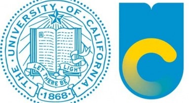
The new logo that the University of California unveiled yesterday can’t be taken seriously, but we laugh so we don’t vomit. That quote, above? That’s an actual quote, by someone who apparently did not think they were saying something so humiliatingly vacuous that the only possible reaction would be to take a vow of silence and change professions. That thing is ugly. But it’s not only ugly because it looks like a Swedish flag being flushed down the toilet; it’s ugly because it so perfectly crystallizes everything that’s been going wrong with the University of California for years, the same mindset that’s been dragging the UC down in its nose-dive with destiny.
Watch this video, for example, in which the administrative deus ex machine dismissively wipes away the book that once was the centerpiece of the UC’s logo and makes “Let There Be Light” into nice eye-catching pastel stripes, all the better to adorn tote bags, mugs, and branded flip-flops:
http://vimeo.com/53530934
I couldn’t imagine a more perfect encapsulation of this university’s lack of vision. Let us get rid of all that tedious business with stuffy old books and enlightenment idealism, and get on with the business of SELLING THE BRAND WITH PASTELS!
Of course, UC president Mark Yudof has been embarrassing us for years; about the time they started planning this new logo, he gave one of the most cringe-worthy interviews in the history of university-presidents-who-seem-to-actively-despise-higher-education, and it’s been downhill from there. When he told the interviewer that “the shine is off” of education, I suppose we should have realized that the only solution was a re-branding campaign. So here we are, now, three years older and deeper in debt; as Voyou puts it, “it’s cool that, for the first time in its history, the University of California has developed a system-wide visual identity. And that that identity is ‘2010 Web 2.0 startup.’”
But that’s not a joke! I mean, it is, but it’s not meant to be: they really are trying to rebrand the university to resemble a flavor-of-the-month startup. As the writer of that “Strength Through Vagueness” article observes, the eleven person team that spent three years designing that monstrosity were originally asked “to come up with a piece of visual collateral that would help them make their case to then-Governor Arnold Schwarzenegger,” and the game-changing visual aesthetic they settled on was Silicon Valley: “UC is a hub not only for groundbreaking research, but for the Bay Area’s burgeoning startup scene.”
As that article continues:
Does the brand give up some of its legacy in the exchange between 19th-century seal and 21st-century Photoshop gradients? Maybe. But take a look at Onward California, its sleek new fundraising site--with its snappy Vimeo videos and Twitter and Facebook integration--and you’ll see why UC is interested in breaking with the past. Correa (who is a Pinterest power user with more than 500,000 followers) understands the value of relating UC to California’s contemporary reputation as a hub for startups and tech innovation, which she says has had "a strong impact on the visual landscape here in California.
I mean, if a Pinterest power user can’t save us, who can? As ReclaimUC pointed out, there's an entire theory of politics embedded in that narrative of saving the UC through re-branding: the best way to pressure politicians to stop de-funding education is not, they seem to think, organizing, activism, and outreach; it's hiring a designer from Chicago to produce a pastel nightmare.
In any case, Cal students seem to be as unimpressed as I am. The Oakland Tribune was unable to find any students on the Berkeley campus that liked the change:
One described the soft colors and block letters as "childish." Another said her first take was "health care." "I feel like when you're talking about a prestigious school, you don't change big things," said senior Correy Johnson. Harry Rackmil, a sophomore, said he was partial to the original logo, but he could see why UC would want a modern look that would stand out in printed materials and online. Anirudh Sri, on the other hand, said he found the whole thing "weird." Though quick to note that the design would have little bearing on his life at Cal, he said he saw the original seal as prestigious, an homage to the system's traditions and history. "Harvard's not going around changing its seal," he said.
Their online poll yields a 95% unfavorable result too. But the new logo is doing a thriving business in scatological-themed photoshopped reinterpretations at the UC Berkeley Reddit, from what I can tell. There’s bird’s-eye on a toilet:
A better toilet:
Elephant’s hindquarters:
Failure to load:
And courtesy of the Boston Review, pepper spray logo:
There were some logo-as-graphic-sex-act that I think we can acknowledge the existence of without actually linking to. But even the University of Washington is making fun of us. Meanwhile, a petition against the change has garnered over twenty thousand signatures in less than twenty four hours. I literally have not encountered anyone whose reaction isn’t somewhere on the spectrum between shock, bewilderment, and rage, and I’ve encountered quite a few of the latter; mine was decidedly of the “Wait, is this a finals week prank?” variety, right up until I became GRADUATE STUDENT SMASH.
Who knows how much this cost. But be reassured, Californians, it’s not your tax dollars at work, here, and that’s kind of the point. Your opinions matter only the shrinking percentage of the university’s budget that the state actually pays for, down from $16k per student in the 1990’s to less than $7k today, and still falling. The state needs that money for building new prisons, for keeping property taxes low, and for not charging vehicle registration fees. But that's why the state isn’t trying to impress its citizens, isn't it? It’s appealing to the tech industry, signaling its desire to hook up for the night with all the subtlety and finesse of a 17 year old at a frat party. It even makes a certain kind of sense: instead of serving the public good by educating students, the university’s fiscal strategy is now a matter of attracting donations and customers, so image and advertisement are the important things. Enter the magic of design; as the new logo’s designer put it, in an interview with the UC Davis student newspaper:
Design is the driver and the motivator. Design is the shape of our cares. It signals our values. Some argue that design is the icing on the cake, the “make-it-pretty” moment. But this ignores the fact that shaping “content” is an expression of your (or your organization’s) point of view. It’s the language of priorities, and it influences everything from politics to commerce to personal relationships.
But it’s important not to lay the blame for this fiasco at her feet. I find this kind of language ridiculous, of course—being someone who likes books more than designs on tote-bags—but she was just doing her job. When she describes her creation this way:
While the monogram is rooted in tradition (it was also meant to reference, in a modern way, the crests of many prestigious institutions of higher learning), it is designed with visual relevance and authenticity top of mind. It is meant to be scalable, flexible, adaptable; something that would let us talk to our diverse audiences while maintaining recognizability. It is also just one piece of a dynamic visual vocabulary we have created.
We should remember that she’s the poor lost soul that had to create a new visionary design for some of the least visionary people on the planet; don’t blame the branding iron for defacing the university, blame the people who hired her and gave her these marching orders:
It's more than a logo...it's a system. The UC monogram with the “University of California” serves as the primary graphic identifier of the university for systemwide communications. However, the visual identity is more than just the mark. Photography, other graphics, typography, color palettes—all these elements help form the "visual ecosystem" for the monogram.
At the risk of waxing nostalgic for days when the UC administration seemed to think that being a university was a cool thing to be, it's worth thinking back to 1963, when the University of California hired the great photographer Ansel Adams to photograph the university’s visual ecosystem, and he produced this beautiful book of photographs called Fiat Lux (whose original prints are now on display at the UCB Bancroft library). Say what you want about Ansel Adams' photographs; he would never have tried to animate our identity with the strength of vagueness. Or at least he would never have gotten within fifty feet of those pastels.
* * *
Just because, here are some faculty and students saying what they want about Ansel Adams' photographs, as part of the "Take Five" program that Catherine Cole organized this year. A logo and a special centennial commemoration book are not the same thing, of course, nor are they supposed to do the same work, so it's probably unfair to hold this sad little Swedish cake to the standards of one of the great photographers of the twentieth century. Or maybe it isn't? Maybe we should think very carefully about the difference.
Michael Pollan:
Gina Patnaik:
Leigh Raiford:
Richard Walker:
Ann Walsh:
Georgina Kleege:
Mark Richards:
Me:
