The publishing and design communities now know that a printed magazine can not only be used to kill at will, but as a particularly efficient tool for political assassinations. While much has been made of this intriguing development (the general surprise being that this achievement in design was made by print and not electronic publishing), few have commented on the innovative aesthetic of the publication that pioneered this method. We’ll seek to remedy this here.
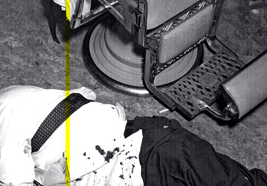
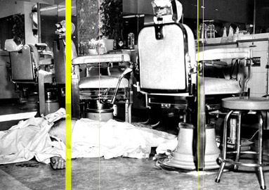
Polymer was a large format magazine, printed on thick 120 gsm matte paper, to a length of 136 and 146 pages respectively, in the only two issues that were ever released. Most of the copies that were printed and distributed have since been seized, and so the work of Art Director Silvia Gladdis has not found the appreciation of a wider audience. It is widely acknowledged as true that peculiar technical aspects of both issues caused readers, first, to salivate an acute neuro-toxin, and second, prompted a targeted brain hemorrhage imbuing them with an overwhelming urge to approach certain elected officials and spit this poison in the face of certain pre-selected targets with gruesome effect. However, it remains that through the unique applications of the magazine format the publication rose above its competitors to excel in a field saturated with slick offerings in recent years. Indeed, the magazine as a form is not dead, though some 57 innocent victims may be.
Several features of the design stand out, for those lucky enough to have been subjected to only the magazine’s aesthetic effects, rather than its more murderous injunctions. The large, lush photographs that advertising art directors normally favor were eschewed in favor of stark line drawings produced only by in-house artists. All of the artwork was, therefore, original, and provided a unique, uniform rendering of the magazine’s contents. While advertising firms originally frothed with rage at the injustice of not being able to maintain their branding standards in print, the “redrawing” policy was a cold-hearted gift, birthing a new, radical look of congruity. Critics of the magazine assaulted this move as mere “minimalism,” but few have had the opportunity to fall under the raw power of this representationalist technique. It worked as cleanly as a surgeon with a scalpel, radically excising the over-logoed emphasis from the brand itself, and truly presenting the products' designs.
The typefaces of the magazine, also designed entirely in-house by Gladdis’s handpicked team, were revolutionary for their ability to achieve a whitewashed indistinctness. Sans-serif faces often draw attention to themselves in their attempt to minimalize the amount of ink on the page, but the designers provided the perfect weight to the lines, allowing the words to insinuate themselves to the eye with guerilla stealth, while leaving the mind clear and unperturbed by the text. The means-to-an-end adoption of minimalism in design achieved a victorious blitzkrieg, while many similar attempts clogging the newsstands only manage rash adventurism.

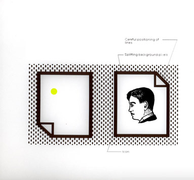
Even the so-called “Pure White Codes” themselves, which were eventually determined to be the means by which the magazine inspired its readership to commit so many fantastic instances of brutal murder, had a quality befitting the publication as a whole. Upon opening the magazine, rather than seeing a blanked of ads and content filling every available inch, the reader’s eye fell easily upon a cleansing blank page opposite each full-page advertisement, sequestered in majesty, apart from the other content. Though, of course, it would turn out they were absorbing more than that. Advances in biofeedback programming made these white spaces anything but empty. There, nearly imperceptible dots of yellow pigment shifted the Pantone color value of certain areas of the paper just beyond the point of conscious awareness, at the very limit of human perception. These wide squares formed the pixelated sigils of Native Diencephalonic Visual Code, or NDVC.
Authorities have not released the means by which NDVC was originally discovered and designed, but what we know is that it is a native visual language that the brain responds to implicitly, bypassing its linguistic centers. Via these Pure White Codes, readers’ brains became unaware weapons. Within hours of looking at the ads and the Pure White Codes, the toxin would begin secreting from their palates and they would hit the streets, searching out targets surreptitiously suggested in Polymer’s articles. When they located a politician, the reader would leap and grasp onto the target’s head, spitting wildly, aiming for the eyes or other orifices. Even after being tased to the point of unconsciousness by the police, readers would claim that they had left their offices or condos merely to get a cup of coffee. The secret component of the design and messaging of the magazine was subtlety. While we are compelled to deplore this sort of coordinated political violence, the aestheticians of the world cannot help by marvel at such unity of form and content.

What was notable about the Pure White Codes in hindsight, is that Polymer was able to raise the bar on the selling of ad space from the aesthetic quality of a billboard to that of a first-rate gallery. The insidious commands the white space was allegedly issuing to the Pons of the human brain and their consequences seem like collateral next to this achievement. Typically, a magazine packs the ads in wherever it can in an attempt to generate revenue in the most efficient way possible. But the breakthrough discovered by the editors of Polymer was that the advertisement were more than twice as effective when paired with a blank empty page.
Though the magazine is now defunct, the publisher is reportedly swamped with inquiries for advertising terms, and we see copycats even now, produced by designers who have heard this story of creative destruction. Look at the current cover of Margin, or the much-lauded center feature of last month’s Hallway to see how the aesthetics of the Pure White Codes live on without the Codes themselves. The editors who originated the technique, unfortunately, are unable to produce future publications along similar lines, as they are currently incommunicado at the government laboratory facilities. The nature of their new federal contracts do not allow them to pursue side projects.
There are rumors of a “disarmed” version of Polymer going to re-release, supported by crowd-funding and a coterie of the magazine’s proponents. This author hopes that we do see it in print once again; good design is to be cherished, studied, and imitated. Toxic or not, Polymer will lurk in the memories of anyone who still appreciates a beautiful magazine.
