Imp Kerr is an enigmatic artist and graphic designer based in New York. HuffPost Arts first heard about her in 2007, when a series of racy faux-American Apparel images went viral. Now Ms. Kerr is employed by The New Inquiry, and regularly blogs for the online magazine in the column, "Shines Like Gold."
Since Imp Kerr's identity remains something of a mystery, we were only allowed to interview her via e-mail, so we're assuming she's an 87-year-old man, even though she claims she was born in a place called "Sweden." Her answers to our questions are below.

HuffPost Arts: When you began your ad spoof series, why did you single out American Apparel in particular?
IK: I guess it was more stimulating (and easier) to pick up a company with a subversive and raunchy touch, than say Abercrombie & Fitch and its glabrous fops, or Gap. I also deliberately profited from the fact that AA was all over the place, in the news and in the streets, all the wows and the eews, and I basically surfed on that ambivalent popularity, putting AA logo on my design and using it to call attention.
It looked like a game between AA and me (What could I do with this brand? How can I vampirize their topicality?), but my series was not really about AA, and contrary to what some people thought, it was not to denounce AA. I am not a feminist, I am not militant... I just like to create scenes and fictions, small worlds, situations that don't exist. And if possible, I make these situations complex, like if you look into them you should find more than you expect, but at the same time I care about making them minimal and appealing in appearance.
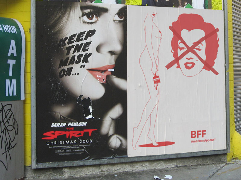
There're several ways to look at the AA series. One is that I simply drew an interlacement of red lines on a white background, which was just lines if you zoomed in, and I was adding the AA logo and a slogan, and I was Photoshopping that design into a street scene. I made about 20 images like that, and posted them along one year. It's a truism but twenty similar images have a stronger effect than one image. So at the end it was a campaign, a story, a small world, subtle enough to confuse and raise questions. From a nude, one spoof ad, it became a hoax and a plural commentary on nudity, advertising, street art, Internet credulity, limits (in representation, judgment, etc), truth and fiction. I was impressed when Hamilton Nolan from Gawker, who I never met before, wrote that the ads were shouting "What is art? What is porn? What is advertising?" These red lines were about nudity (like in "nude is a classical theme in Art History") and about advertising ripping off art like art ripped off advertising (zzzzz), but above all, they were an aperture to many questions, first because there were twenty of them.